How com only certain original .ico (icon) files can be set as hotkeys?
Discussion Open
Hello
In MindManager for windows (v2023 and also v2020) some of the icon files (.ico) allow the user to apply them using a hotkey (Control +1 to Control +9) but other icon files do not.
i.e. For some files when you right click on them in MindManager you get a context menu that popups up called "Short Key". However other .icon files in the library don't give this menu option. Why? What is the difference?
Is it something to do with .ico file resolutions? or colour depth?
Thanks
J


There are two types of icon in MindManager:
There are two types of icon in MindManager:
There are two types of icon in MindManager:
There are two types of icon in MindManager:
Yes, so what exactly is the difference between a "Stock" icon file and a "Custom" icon file?
It seems to be something about the individual files themselves...
And how can we generate "Stock" icon files so that we can assign shortcut keys to them?
J
Yes, so what exactly is the difference between a "Stock" icon file and a "Custom" icon file?
It seems to be something about the individual files themselves...
And how can we generate "Stock" icon files so that we can assign shortcut keys to them?
J
Hi Nick and John,
John, apologies for not responding earlier to your questions about this on the other thread. I was trying to get to the bottom of the issue but without a lot of success. Fortunately Nick has identified the issue.
Nick, this issue has come up because John asked about a hotkey/smart/key combination to mark all selected tasks as complete in another thread: https://community.mindmanager.com/topic/2674-is-there-a-hotkey-to-mark-tasks-as-being-100-completed-i-e-task-done. He had identified the option of using the Priority smartkeys and was wondering if there was a better way, I suggested using another smartkey-enabled icon, or alternatively clicking in the Progress icon of any one of the selected tasks and selecting the 100% complete icon.
However John would like to do this via smartkeys but in such a way that any icon used in this way does not have to appear in the map, but this does not seem to be possible. Therefore I was wondering if it would be possible create a macro linked to some sort of hotkey combination that could be used to mark selected topics as 100% complete without having to involve an icon.
Yes that's exactly right, thanks Alex.
To clarify, since my Check icons have to to remain visible if my progress icons are to be seen, I want to edit the icons that I use with hotkeys so as to make them extremely faded and barely visible. This way, one's eye focuses on the outstanding tasks rather than the completed ones.
J
PS As a general comment, it might just be me, but I prefer using a more muted, subtle color palette compared to the bold/shouty options that MindManager typically provides.
Hi John, re your last comment, see the discussion on an idea I posted in the forum last year: https://community.mindmanager.com/topic/1825-provide-quieter-alternatives-to-the-bright-green-100-finished-progress-icon
As I noted in this thread, it is possible to use a combination of topic properties, formulas, SmartRules and your own icons to set up and track progress independently of the built-in system, but this is tricky and time-consuming to do. I’ve described how to do this with checklists which have just two options in this post on my blog:
https://sociamind.com/2021/09/30/setting-up-alternative-checklists-in-mindmanager/
Thank you Alex
I did have a quick look at your suggestion...
Quick question: Does what you have set up allow the user to move between checklist items using a hotkey?
If not I think I'll bow out gracefully at this point because TBH, this is getting a bit too advanced for me.
Back to the overly bright green tick on a transparent background, I am still wondering where the master copy of the icon is stored. I mean is it literally compiled into the application DLLs somewhere? (If not I wonder if there might be a way to do open-heart surgery on that file "check.ico" to make it appear as grey not bright green ??)
Hi John,
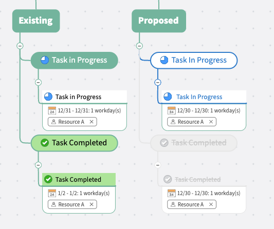
MindManager has had green checkmarks for a long time. I think before that the checkmarks were dark blue. That said I agree with you that in most cases I want completed tasks to fade away so I can focus on those that are not completed. What are your thoughts on the following proposal?

Hi John,
MindManager has had green checkmarks for a long time. I think before that the checkmarks were dark blue. That said I agree with you that in most cases I want completed tasks to fade away so I can focus on those that are not completed. What are your thoughts on the following proposal?

---