


Can't pan around HTML maps with a large central topic when they first open on mobile phone screen
So every day a school day with MindManager, even after 20+ years!
I create a lot of maps of websites, events and reports of relevance to particular communities and share them using the publisher feature and link. I often share them and the link on Linkedin too.
I have settled on the 'ORG-TRE' layout as the best one for the job - 'org map' layout for the first 1 or maybe 2 levels, then vertical tree for subsequent levels, with a couple of floating topics with user tips and my company info. This works well for said websites, events and reports as they usually have a very well defined hierarchical structure. The resulting 'pseudo grid' layout also doesn't seem to 'scare the horses' in a way that a more traditional mindmap layout would for non mappers.
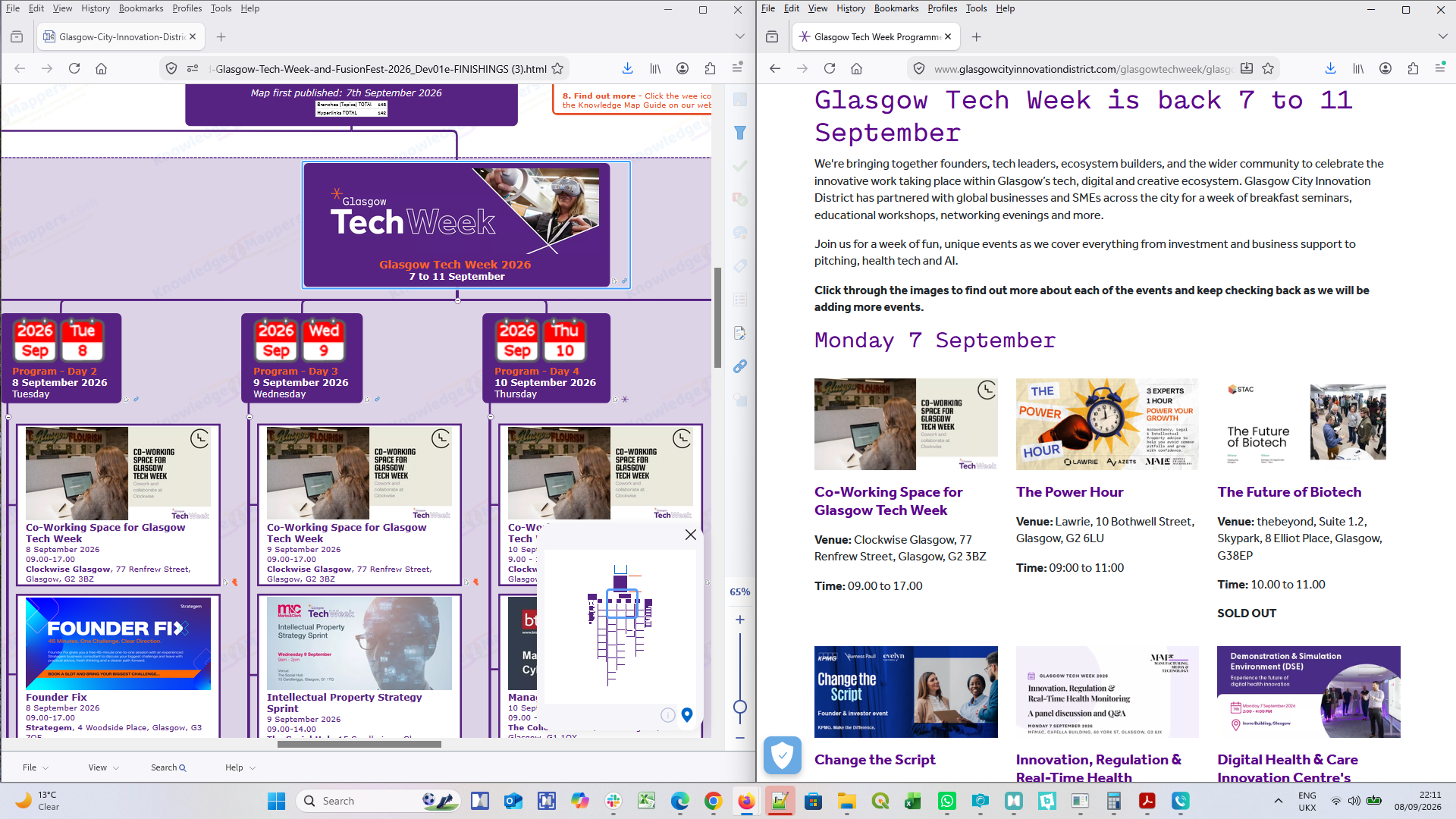
Anyway for the most recent map I shared of last week's Glasgow Tech Week (link below) I opened the share link on my mobile phone for a change. Glasgow is my home city and I was physically out and about at some of the networking events and wanted to answer people who asked 'what do you do' by immediately showing them the event map on my phone.
However once the map opened on my phone I discovered I couldn't do anything with it, it refused to respond to any of my gestures on the touch screen - wouldn't pan around or zoom out. It was just frozen. I only resolved the deadlock by doing a search for a term I knew was on a sub-branch so the map re-focused there.
After a bit of experimentation I realised the problem was that, when the map first opened, even though the zoom scale was down to 65%, on a small screen the central topic still filled it entirely (because the map automatically opens focused on the centre of the central topic). The 'every day a school day' bit came in when I realised that, on a touch screen, touching anywhere within a topic can only be interpreted as 'topic selection'. If you want to pan / zoom etc. you have to start your finger drag by touching a part of the screen that isn't anywhere within a topic boundary. Fine if you are zoomed out and can see surrounding space, but if a topic fills the whole screen then you can't 'go' anywhere!
This issue is compounded by the fact that the HTML map rendering is different on a mobile screen and a laptop screen / monitor. On the mobile screen the length of the lines of text in topic text is about 20% shorter, meaning you now get 20% more lines of text within a topic, which then becomes 20% taller (it doesn't seem to get any narrower though, it just gets a much bigger margin between the edge of the text and the topic boundary line).
So if you look at the map below on a mobile phone screen and a laptop / monitor you'll see what I'm talking about.
Does anybody have anybody immediate suggestions to get round the problem (other than just have minimum content in a central topic)?
And for the development team is there something that can be built in to the map sharing process so that the situation never arises in the first place? It obviously 'knows' if it's opening on a mobile screen or a laptop / monitor and renders accordingly so there seems to be some intelligence already there.
Personally I would like my 'ORG-TRE' maps to open with the screen centred on the point at which the horizontal branch line to the main topics emerges from the bottom of the central topic. Thus the top of 'tall' central topics would disappear off the top of the screen whilst the 1st level of topics would be at least partially visible so the user would know 'where to go'.
https://share.mindmanager.com/#publish/81zIikEn8kOaWamGoO1XWlz5TSLjm3si7sW7XEtG
DataLab-and-DataFest-2026_SHARE-BETA
---