


Can't pan around HTML maps with a large central topic when they first open on mobile phone screen
So every day a school day with MindManager, even after 20+ years!
I create a lot of maps of websites, events and reports of relevance to particular communities and share them using the publisher feature and link. I often share them and the link on Linkedin too.
I have settled on the 'ORG-TRE' layout as the best one for the job - 'org map' layout for the first 1 or maybe 2 levels, then vertical tree for subsequent levels, with a couple of floating topics with user tips and my company info. This works well for said websites, events and reports as they usually have a very well defined hierarchical structure. The resulting 'pseudo grid' layout also doesn't seem to 'scare the horses' in a way that a more traditional mindmap layout would for non mappers.
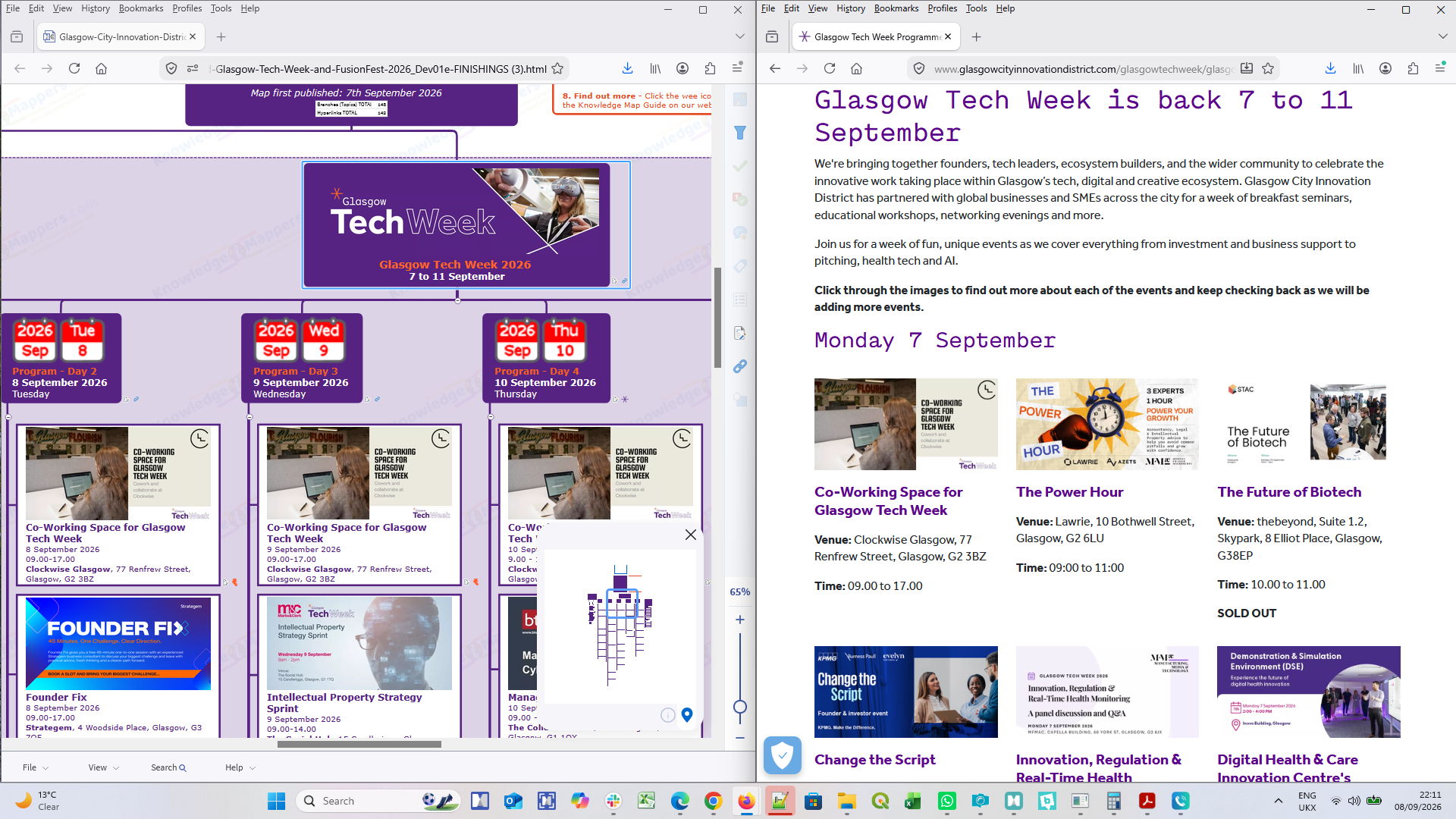
Anyway for the most recent map I shared of last week's Glasgow Tech Week (link below) I opened the share link on my mobile phone for a change. Glasgow is my home city and I was physically out and about at some of the networking events and wanted to answer people who asked 'what do you do' by immediately showing them the event map on my phone.
However once the map opened on my phone I discovered I couldn't do anything with it, it refused to respond to any of my gestures on the touch screen - wouldn't pan around or zoom out. It was just frozen. I only resolved the deadlock by doing a search for a term I knew was on a sub-branch so the map re-focused there.
After a bit of experimentation I realised the problem was that, when the map first opened, even though the zoom scale was down to 65%, on a small screen the central topic still filled it entirely (because the map automatically opens focused on the centre of the central topic). The 'every day a school day' bit came in when I realised that, on a touch screen, touching anywhere within a topic can only be interpreted as 'topic selection'. If you want to pan / zoom etc. you have to start your finger drag by touching a part of the screen that isn't anywhere within a topic boundary. Fine if you are zoomed out and can see surrounding space, but if a topic fills the whole screen then you can't 'go' anywhere!
This issue is compounded by the fact that the HTML map rendering is different on a mobile screen and a laptop screen / monitor. On the mobile screen the length of the lines of text in topic text is about 20% shorter, meaning you now get 20% more lines of text within a topic, which then becomes 20% taller (it doesn't seem to get any narrower though, it just gets a much bigger margin between the edge of the text and the topic boundary line).
So if you look at the map below on a mobile phone screen and a laptop / monitor you'll see what I'm talking about.
Does anybody have anybody immediate suggestions to get round the problem (other than just have minimum content in a central topic)?
And for the development team is there something that can be built in to the map sharing process so that the situation never arises in the first place? It obviously 'knows' if it's opening on a mobile screen or a laptop / monitor and renders accordingly so there seems to be some intelligence already there.
Personally I would like my 'ORG-TRE' maps to open with the screen centred on the point at which the horizontal branch line to the main topics emerges from the bottom of the central topic. Thus the top of 'tall' central topics would disappear off the top of the screen whilst the 1st level of topics would be at least partially visible so the user would know 'where to go'.
https://share.mindmanager.com/#publish/81zIikEn8kOaWamGoO1XWlz5TSLjm3si7sW7XEtG
DataLab-and-DataFest-2026_SHARE-BETA
So 3 weeks on I have a more refined workaround in the moment, but the issue remains (eg. this latest map when opened on a mobile - https://share.mindmanager.com/?mm_link_external=true#publish/8LtLAy8C9K6SpgvzmSJyNXrVmoKnpUWItEtu_lSL).
The workaround is to 1) Not panic, and 2) Go to the View menu at the bottom of the screen and select either Zoom Out or Auto Fit, and then proceed as normal. However it doesn't solve the issue for new users looking at a map for the first time and are unfamiliar with the interface. They are clicking on the link on their phone because that is where they first come across it and I guess, not unreasonably, would be expecting what they have been invited to look at 'works' on their device.
As I said above, there needs to be some way of not getting into the situation in the first place, or the system 'knowing' the situation has arisen and taking some sort of corrective action. It is still possible during scrolling around the map to arrive back in the situation of a topic filling the whole screen depending on your zoom level.
So 3 weeks on I have a more refined workaround in the moment, but the issue remains (eg. this latest map when opened on a mobile - https://share.mindmanager.com/?mm_link_external=true#publish/8LtLAy8C9K6SpgvzmSJyNXrVmoKnpUWItEtu_lSL).
The workaround is to 1) Not panic, and 2) Go to the View menu at the bottom of the screen and select either Zoom Out or Auto Fit, and then proceed as normal. However it doesn't solve the issue for new users looking at a map for the first time and are unfamiliar with the interface. They are clicking on the link on their phone because that is where they first come across it and I guess, not unreasonably, would be expecting what they have been invited to look at 'works' on their device.
As I said above, there needs to be some way of not getting into the situation in the first place, or the system 'knowing' the situation has arisen and taking some sort of corrective action. It is still possible during scrolling around the map to arrive back in the situation of a topic filling the whole screen depending on your zoom level.
Hi Angus,
I see your point.
But even on my laptop big screen your map is overwhelming.
Could you create a preceding map where you explain what they will see and how to use the map. And inthere a button to click to go to the Huge map?
For me this would help
Hi Angus,
I see your point.
But even on my laptop big screen your map is overwhelming.
Could you create a preceding map where you explain what they will see and how to use the map. And inthere a button to click to go to the Huge map?
For me this would help
Hi Ary
Thanks for taking the time to respond and for your valuable feedback. Lots of issues to unpack but I don't have time to fit them all together into a nice coherent flow, so I'll just do bullet points...
1) Designing for User Experience - Firstly be assured that user overwhelm is always in my mind when creating maps. The difficulty is designing for the very different levels of experience of using maps that potential users have. Especially those I share using the Publisher route on Linkedin, which I hope will reach new users that 'don't know what the whole knowledge mapping thing is all about', but it's self-evident once they are looking at the map. However how do you incorporate user instructions into a map so that people who have never looked at - let alone used - a map before can find them and use them, that's the paradox? The instructions can't be in the central topic as that has to explain what the users are looking at as that is the place they 'land'. They also can't be buried in sub-branches or attached as notes, as users don't know what these are yet! So the 'User Tips' floating topic is what I have come up with so far. However obviously a big box of text that is always there and can't be hidden adds to the visual overwhelm. (I will revisit it soon though).
2) Central topic has to explain what the whole map is - The central topic is the equivalent of 'the cover' - back and front - of a normal document / book. It has to say what it is but also entice the reader to explore more especially, as mentioned in point 1, I want to attract new users who are interested / familiar in the subject matter but haven't seen it presented in map form before. Ideally it would just be the title with the 'blurb' (ie. further explanatory text) in the topic note, but for new users it has to be 'immediately obvious'. The consequence of this obviously is to drastically increase the physical footprint of the central topic, which leads to the problem that this question is all about!
That said I think that technical problem would still be there on small mobile screens even if the extra text wasn't there. If you accept that there needs to be an image as part of the central topic too as well as the title, then the central topic would still take up most of the screen when the map opens. Don't forget my map is already zoomed out to 65%. Most folk would probably still be working at 100%!
3) My knowledge map is a 'visually structured event listing', not a mindmap - This particular map is an alternative way of presenting a listing of the events that are all parts of the same, real world, bigger thing ie. 'Glasgow Tech Week'. They are also an alternative formatting of the existing, 'mainstream' knowledge resource ie. the events schedule pages on the official festival website (and maybe even a physically printed program for those events with a bigger budget). Thus my map is not a mindmap (ie. my/our thoughts on this concept of my/our own making'), but of a real world thing, with it's own, known, well accepted structure that the map of it necessarily has to fundamentally incorporate. Events cover particular subjects, involve particular speakers and take place at a particular time, on a particular day within an overall festival program, in a particular venue if there's more than one possible one, with perhaps more than one stream of events happening at the same time. All that information has to be incorporated within the event-sub-branch so it can be quickly imparted to the end user. There are a range of 'clever ways' of potentially dong that in MindManager, but again because of the intended audience the easiest thing is to incorporate it into the branch text. This of course also adds to the visual overwhelm, but at least with the 'rich text' environment and thumbnail images of Mind Manager variable formatting can be used to try and reduce that, just as it is in normal digital or physical documents.
Perhaps a very experienced mindmapper like yourself always sees a mindmap first thing because that's what they are expecting to see? (but I totally accept the visual overwhelm argument too).
That said, imagine you are a MindManager user and you are attending this festival to learn more. If you have this listings map in MindManager format, suddenly you have a single place that you can add your own lecture notes to, so that they can be found again - and subsequently shared - in context. Great!!
4) I see my Knowledge Maps as the equivalent of Geographic Maps - As you probably know my professional origins are in geographic map making 30 years ago, so starting in the early days of digital mapping on desktop computers in a predominantly paper map world, all the way through to the internet mapping experience that is Google Maps etc. these days. When I discovered MindManager in 2002 and got into digital mindmapping, I was immediately struck by the similarities between mapping 'geographic space' and 'conceptual / knowledge space'. You can read the full story of 'my journey' in the 'Background' tab of my Map Guide - https://knowledgemappers.com/map-store/#Store-Map-Guide.
The relevant points in this discussion are.....
- You know 'what' a geographic map is and how to use it - geographic maps are a fundamentally different way of capturing and transmitting information / knowledge than traditional, linear documents. At some point in your life you encountered a map for the first time. I think we're similar ages so it was probably on paper. It doesn't matter, somebody (your dad, your Scout Master) explained the concept to you and you just 'got it'. The point symbols, the lines, the different shaded areas, the different colours..... You could now 'read' any geographic map and use it to at least start to understand the real world area it represents. From the other end, you can be presented with a particular image and probably work out that it is a map - a picture that depicts things in a particular part of a 'real world somewhere', and crucially the relationship between them within that space.
My maps are all pretty similar in structure and layout etc., - they use the same visual language if you will - and even though they can depict very different things, they are all real world things that the user will have some concept of, so the user's existing knowledge and my knowledge map meet in the middle somewhere. Hopefully once you know how to use one, you can use any of them!
- The similarities with Google maps - This leads to Google maps and other digital, online map platforms....
1) Seeing as how you could already use a geographic map, you probably worked out how to use them pretty quickly and didn't really need much of a tutorial. Maybe the more advanced features like driving routes etc., but not just to arrive, pan about, zoom in and out, and just discover what 'things are there' (roads, settlements, natural features etc.), at that particular 'place'. Most people found their house first and the area surrounding it ie. places that they were very familiar with already.
2) You also worked out how to change the type of underlying map to see different sorts of things (traffic, terrain, satellite etc.), and that though every 'thing' is there in the source geo-database, what you can see within that map type at the different zoom scales is intelligently controlled by the system.
3) Unfortunately MindManager is not smart like that. The map maker has to decide in advance what the zoom scale is of the map when the end user first arrives, and how many levels of detail are already visible, and how many the user will have to switch on / drill down into themselves. A judgement call to make, and you won't get it right every time for every user.
4) Google maps have worked out how to zoom around maps on small mobile screens whist still being able to select objects within the map to find out more about them. At no point does the Google map 'freeze' just because of a property of an object in the map it is rendering....
As usual I have gone on for longer than I intended, but sometimes it is good to take the time to organise your thoughts in order to explain them to others....
I hope you can see the method in my madness anyway (though that doesn't make me any more sane ;-)
Thanks
Angus
Hi Ary
Thanks for taking the time to respond and for your valuable feedback. Lots of issues to unpack but I don't have time to fit them all together into a nice coherent flow, so I'll just do bullet points...
1) Designing for User Experience - Firstly be assured that user overwhelm is always in my mind when creating maps. The difficulty is designing for the very different levels of experience of using maps that potential users have. Especially those I share using the Publisher route on Linkedin, which I hope will reach new users that 'don't know what the whole knowledge mapping thing is all about', but it's self-evident once they are looking at the map. However how do you incorporate user instructions into a map so that people who have never looked at - let alone used - a map before can find them and use them, that's the paradox? The instructions can't be in the central topic as that has to explain what the users are looking at as that is the place they 'land'. They also can't be buried in sub-branches or attached as notes, as users don't know what these are yet! So the 'User Tips' floating topic is what I have come up with so far. However obviously a big box of text that is always there and can't be hidden adds to the visual overwhelm. (I will revisit it soon though).
2) Central topic has to explain what the whole map is - The central topic is the equivalent of 'the cover' - back and front - of a normal document / book. It has to say what it is but also entice the reader to explore more especially, as mentioned in point 1, I want to attract new users who are interested / familiar in the subject matter but haven't seen it presented in map form before. Ideally it would just be the title with the 'blurb' (ie. further explanatory text) in the topic note, but for new users it has to be 'immediately obvious'. The consequence of this obviously is to drastically increase the physical footprint of the central topic, which leads to the problem that this question is all about!
That said I think that technical problem would still be there on small mobile screens even if the extra text wasn't there. If you accept that there needs to be an image as part of the central topic too as well as the title, then the central topic would still take up most of the screen when the map opens. Don't forget my map is already zoomed out to 65%. Most folk would probably still be working at 100%!
3) My knowledge map is a 'visually structured event listing', not a mindmap - This particular map is an alternative way of presenting a listing of the events that are all parts of the same, real world, bigger thing ie. 'Glasgow Tech Week'. They are also an alternative formatting of the existing, 'mainstream' knowledge resource ie. the events schedule pages on the official festival website (and maybe even a physically printed program for those events with a bigger budget). Thus my map is not a mindmap (ie. my/our thoughts on this concept of my/our own making'), but of a real world thing, with it's own, known, well accepted structure that the map of it necessarily has to fundamentally incorporate. Events cover particular subjects, involve particular speakers and take place at a particular time, on a particular day within an overall festival program, in a particular venue if there's more than one possible one, with perhaps more than one stream of events happening at the same time. All that information has to be incorporated within the event-sub-branch so it can be quickly imparted to the end user. There are a range of 'clever ways' of potentially dong that in MindManager, but again because of the intended audience the easiest thing is to incorporate it into the branch text. This of course also adds to the visual overwhelm, but at least with the 'rich text' environment and thumbnail images of Mind Manager variable formatting can be used to try and reduce that, just as it is in normal digital or physical documents.
Perhaps a very experienced mindmapper like yourself always sees a mindmap first thing because that's what they are expecting to see? (but I totally accept the visual overwhelm argument too).
That said, imagine you are a MindManager user and you are attending this festival to learn more. If you have this listings map in MindManager format, suddenly you have a single place that you can add your own lecture notes to, so that they can be found again - and subsequently shared - in context. Great!!
4) I see my Knowledge Maps as the equivalent of Geographic Maps - As you probably know my professional origins are in geographic map making 30 years ago, so starting in the early days of digital mapping on desktop computers in a predominantly paper map world, all the way through to the internet mapping experience that is Google Maps etc. these days. When I discovered MindManager in 2002 and got into digital mindmapping, I was immediately struck by the similarities between mapping 'geographic space' and 'conceptual / knowledge space'. You can read the full story of 'my journey' in the 'Background' tab of my Map Guide - https://knowledgemappers.com/map-store/#Store-Map-Guide.
The relevant points in this discussion are.....
- You know 'what' a geographic map is and how to use it - geographic maps are a fundamentally different way of capturing and transmitting information / knowledge than traditional, linear documents. At some point in your life you encountered a map for the first time. I think we're similar ages so it was probably on paper. It doesn't matter, somebody (your dad, your Scout Master) explained the concept to you and you just 'got it'. The point symbols, the lines, the different shaded areas, the different colours..... You could now 'read' any geographic map and use it to at least start to understand the real world area it represents. From the other end, you can be presented with a particular image and probably work out that it is a map - a picture that depicts things in a particular part of a 'real world somewhere', and crucially the relationship between them within that space.
My maps are all pretty similar in structure and layout etc., - they use the same visual language if you will - and even though they can depict very different things, they are all real world things that the user will have some concept of, so the user's existing knowledge and my knowledge map meet in the middle somewhere. Hopefully once you know how to use one, you can use any of them!
- The similarities with Google maps - This leads to Google maps and other digital, online map platforms....
1) Seeing as how you could already use a geographic map, you probably worked out how to use them pretty quickly and didn't really need much of a tutorial. Maybe the more advanced features like driving routes etc., but not just to arrive, pan about, zoom in and out, and just discover what 'things are there' (roads, settlements, natural features etc.), at that particular 'place'. Most people found their house first and the area surrounding it ie. places that they were very familiar with already.
2) You also worked out how to change the type of underlying map to see different sorts of things (traffic, terrain, satellite etc.), and that though every 'thing' is there in the source geo-database, what you can see within that map type at the different zoom scales is intelligently controlled by the system.
3) Unfortunately MindManager is not smart like that. The map maker has to decide in advance what the zoom scale is of the map when the end user first arrives, and how many levels of detail are already visible, and how many the user will have to switch on / drill down into themselves. A judgement call to make, and you won't get it right every time for every user.
4) Google maps have worked out how to zoom around maps on small mobile screens whist still being able to select objects within the map to find out more about them. At no point does the Google map 'freeze' just because of a property of an object in the map it is rendering....
As usual I have gone on for longer than I intended, but sometimes it is good to take the time to organise your thoughts in order to explain them to others....
I hope you can see the method in my madness anyway (though that doesn't make me any more sane ;-)
Thanks
Angus
PS - Sorry I forgot to answer your point about creating a preceding map that explains what you are about to see. My point above about users 'working it out' for themselves just like they did with Google maps notwithstanding, for the HTML map shared using Publisher (or any other map for that matter), I am not in control of....
- Where the user is coming from - They have just clicked on a link. It could be from a Linkedin post (and thankyou for liking those :-), a blog post on my website, or maybe it's been sent in an email by a colleague who came across it on there. Yes I can can add more information to a LI post so that users know more about what to expect - and I have done that with the last one I posted and I will endeavour to do that again - but there are maximum character limits on LI posts that need to be taken into account, and my posts are pretty long as they are. Remember I'm trying to attract the attention of new users that are interested in the subject matter but don't know about knowledge maps so the posts already have to do quite a bit of groundwork as it is. Also as I said that doesn't cover every route to the map, and by the time they've arrived some information is reduntant eg. what happens when they click on the link and how long the map will take to load in their browser window.
- Where they 'land' when they arrive - It's always on the centre point of the central topic at the zoom scale the map was at when it was published. End of...... So even though I've got the User Notes topic there, I can't change anything to make people land on it so they have to read first. I argued the case in my initial problem above that for this type of map layout - an organisation map for the first couple of layers - the centre point of the screen when it opens needs to be the point at the bottom of the central topic where the branches emerge so users can see the 1st level of main topics and so work out what the map is showing. eg. my event listings maps always include calendar images for the different days.
Perhaps Nick Duffill's idea of the 'two sided map' would be good here, though maybe it's the wrong way round from what he wants. In this case you would land on the 'cover' of the map that explained what it was and with a big 'click here' button to then 'open the other side', which was the map proper.
PS - Sorry I forgot to answer your point about creating a preceding map that explains what you are about to see. My point above about users 'working it out' for themselves just like they did with Google maps notwithstanding, for the HTML map shared using Publisher (or any other map for that matter), I am not in control of....
- Where the user is coming from - They have just clicked on a link. It could be from a Linkedin post (and thankyou for liking those :-), a blog post on my website, or maybe it's been sent in an email by a colleague who came across it on there. Yes I can can add more information to a LI post so that users know more about what to expect - and I have done that with the last one I posted and I will endeavour to do that again - but there are maximum character limits on LI posts that need to be taken into account, and my posts are pretty long as they are. Remember I'm trying to attract the attention of new users that are interested in the subject matter but don't know about knowledge maps so the posts already have to do quite a bit of groundwork as it is. Also as I said that doesn't cover every route to the map, and by the time they've arrived some information is reduntant eg. what happens when they click on the link and how long the map will take to load in their browser window.
- Where they 'land' when they arrive - It's always on the centre point of the central topic at the zoom scale the map was at when it was published. End of...... So even though I've got the User Notes topic there, I can't change anything to make people land on it so they have to read first. I argued the case in my initial problem above that for this type of map layout - an organisation map for the first couple of layers - the centre point of the screen when it opens needs to be the point at the bottom of the central topic where the branches emerge so users can see the 1st level of main topics and so work out what the map is showing. eg. my event listings maps always include calendar images for the different days.
Perhaps Nick Duffill's idea of the 'two sided map' would be good here, though maybe it's the wrong way round from what he wants. In this case you would land on the 'cover' of the map that explained what it was and with a big 'click here' button to then 'open the other side', which was the map proper.
---