
Published map struggles with floating topics; how can i avoid that?
Answered
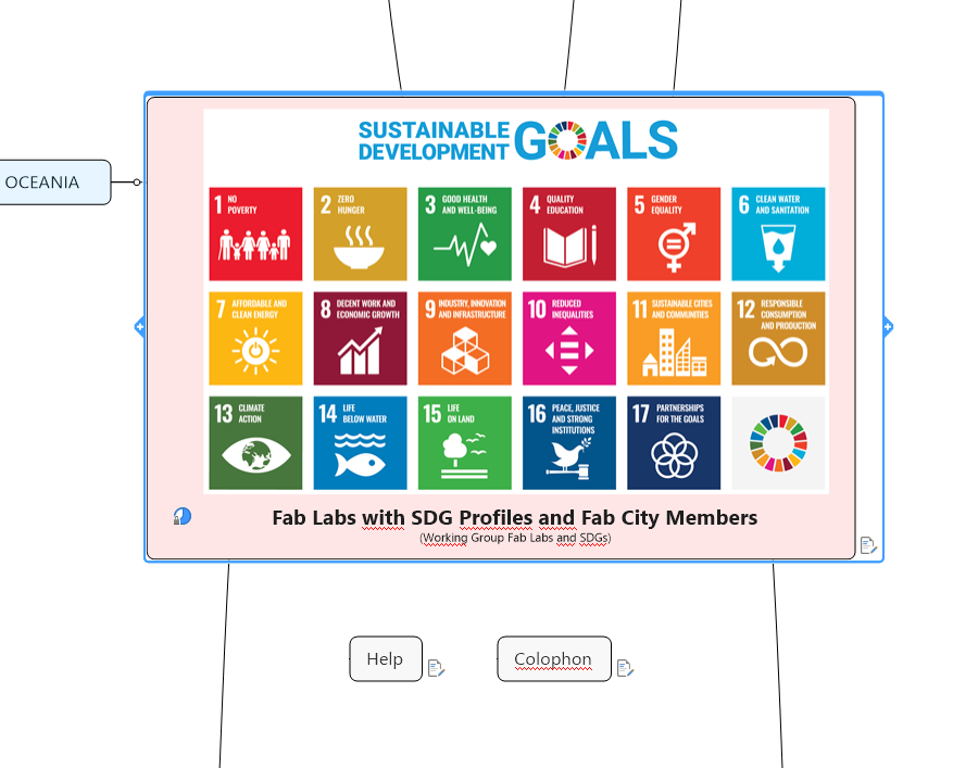
The first picture shows my map with central topic and two floating topics. Look at the text in the central topic and the position of the two floating topics.
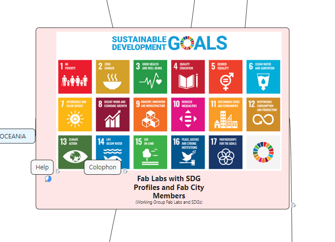
The second picture shows the results of this same map when published. The text in the central topic has been folded and the floating topics are mixed with the central topic.
How can I avoid this mix and get a html5 map that looks the same as the original mmap?
You can view the map yourself via https://bit.ly/fablist-sdgs.
Hi Pieter,
congrats to this fantastic map 👍
Please check this version of your map https://share.mindmanager.com/#publish/vprbO1JbBYpQU7faursLGiUEef4uMUxNM98VFWus
The distance of the central topic to the main topics was to small. You added a large pic in the middle, so the calculated distance from 8 cm is much to small. I corrected it up to 75 cm.
Hope this is exactly what you meant to have.
Best regards, Andreas
Hello Pieter,
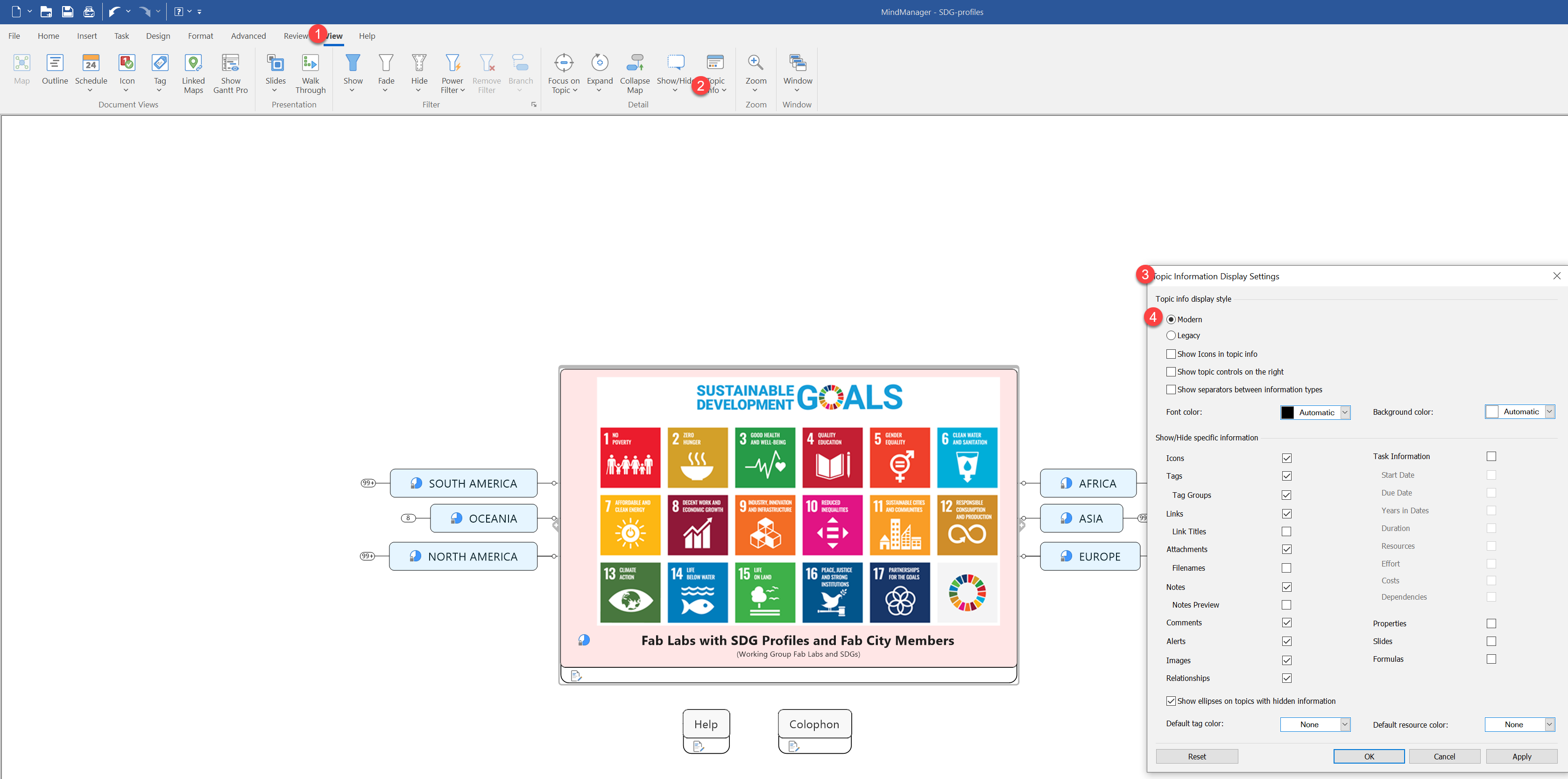
Thanks for the feedback and for providing the link to your published map. From what I found, the issue with the Floating Topics overlapping the Central Topic is reproducible when the map has Legacy Topic Info Style Settings.
You can avoid this by setting your Topic Info Display Style setting to Modern.
Our QA Team will further investigate the issue when Legacy Topic Info Display Style settings are applied.
Best regards,
-Marian
Hi Pieter,
this also can happen if the distance between the connected and the floating topics is not wide enough.
I can see in your pic that you've activated the "Quick Add buttons". Need additional space, deactivate them.
Best regards, Andreas
Hi Pieter,
this also can happen if the distance between the connected and the floating topics is not wide enough.
I can see in your pic that you've activated the "Quick Add buttons". Need additional space, deactivate them.
Best regards, Andreas
---