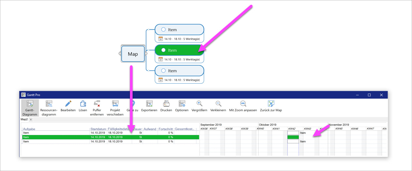
Meaningless, obstructive and therefore wrong adoption of a text formatting:
Discussion Open
Why are colors of branch texts taken over in the Gantt, although they are not there in front of the same background color? - After all, this mechanism severely restricts the use of colors or even makes this impossible. This is particularly annoying when you have already invested a lot of time in a map, in particular mechanisms (e.g. formatting via Smart Rules) and then have to realize at the end that all the effort was in vain because the Gantt is not readable.


As a workaround, you can disable the topic fill and text colours in the Gantt chart. In the Task tab, click the drop-down arrow on "Show Gantt Pro" and click "Default Options". Then un-check "Show topic font and fill colours in chart".
Unconditionally applying pale text colours to the text next to the bar is incorrect as you say and should be logged as a bug.
---