Odd positioning of map parts
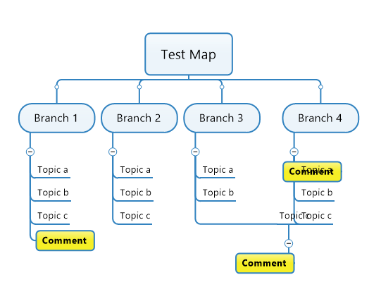
I'm having an unusual problem with map parts. When I create a map part and then click on it to add it to a topic or subtopic in a map, the part is pasted incorrectly as shown below:

The yellow Comment subtopic is the created map part, as shown under Branch 1. This is how it should appear when added, but instead it ends up incorrectly located as shown under Branch 3 where it is meant to be a sub-subtopic under Topic c, and in Branch 4 where it it is meant to be a subtopic to the main topic.
Clicking on Layout at the Main Topic level for each branch and changing this to Tree at the branch level will correct the layout, but this setting is ignored when a map part is added again, and the problem is repeated. This is annoying, and embarrassing when you are using a map in an interactive workshop session.


Hello Alex,
Could you add more info about your map part, please. How did you create it? which topic do you use and which formatting for it? Could you attach your map part for investigation.
Thanks
Hello Alex,
Could you add more info about your map part, please. How did you create it? which topic do you use and which formatting for it? Could you attach your map part for investigation.
Thanks
Update:
We were able to reproduce the issue and we will fix it soon. Thanks for reporting this problem.
Update:
We were able to reproduce the issue and we will fix it soon. Thanks for reporting this problem.
---