
Alternative set of priority icons
Voting Open
Hi,
the colors of the priority icons are nice and probably good for printing, but they do not support the shift in meaning from important to unimportant. They don't follow any visual logic, so you mostly have to read the numbers to see if a branch is high or low priority. The result is a kind of uncertainty, especially if the map contains other colorful icons. Perhaps the only current exception is the red one.
I suggest considering an alternative color set. I have shown one possibility in the attached sketch: from warm and important to cold and less important.
A further way could be to let us color the icons as we like.
Files:
Priority Icons...
 I like this idea
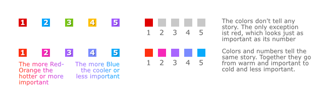
---